
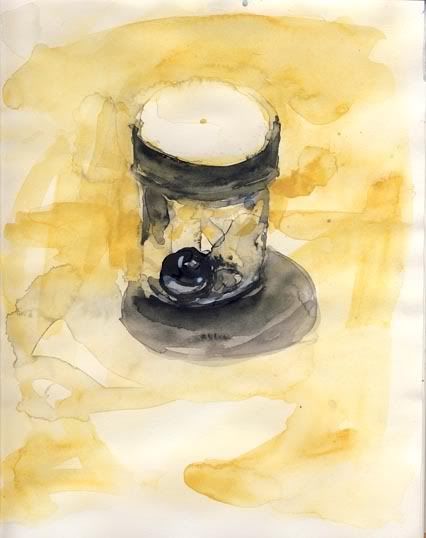
So I'm coming into a little time of my paintings where I'm realizing I'm better at using certain colors than others. Back in my freshmen life drawing days the paintings i created on a cooler surface were more controlled and focuses than my drawings on bright colored paper. In watercolor, the paintings I create using a yellow tone tend to come out more focused. I'm thinking its because of yellow's pale tones ( in this case, yellow ochre) that allow me to make more mistakes, allowing me more time to save the awful mess I've created. I'm also limiting myself lately to the use of only three or four colors. a yellow, a red, a blue and usually charcoal grey/ lamp black. Currently , its been one of each:
Yellow Ochre/ Naples
Cerulean Blue/ French Ultramarine/ Cobalt
Cadmium Red Deep/ Cadmium Red/ Indian Red
Charcoal Grey/ Lamp Black/ or Indigo+Cadmium Red Deep


No comments:
Post a Comment